


NEW LOGO FOR DALLAGNESE
The evolution of the Dallagnese brand has gone hand in hand with the history and the changing objectives of the company.
The new Dallagnese sign
Starting with classic Italian style furniture, which has distinguished the company for many years now, in the last decade it has moved towards modern styles, gaining great appreciation both in Italy and abroad.
This path started from the first logotype (in 1948), particularly drawn and painted, to its elegant version with a serif font (in 2000-05), up to its most recent version where the initial letters “D” and “A” almost become the brand’s pictogram (in 2010). As can be seen, a recurring element over time has always been the more or less evident reference to the colour red.


The change
In 2021, however, Dallagnese is a different company, with a new ownership, a significantly renewed product style and ambitious goals to pursue. To mark the beginning of this new chapter, by correctly repositioning the company in the market, a new logo was chosen, decisive and bold.

The new Dallagnese logo
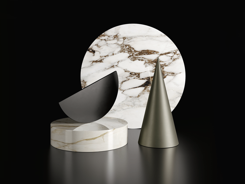
In the name of high readability, the new Dallagnese logo is simple, clean and linear, it uses a font made up of primary geometric figures such as the circle and, in the bold version, it communicates great strength and elegance.

The simplification work is evident: intentionally no pictograms or symbols were included, and the apostrophe was removed to improve readability and usability.
The entire brand identity will be updated in the coming weeks. Follow us to find out what’s new!